What happened?
That after having wrote the second draft, and after one year of pause, when I went back to read that story, I could remember every single sentence, and I could not fix any mistake.
Re-reading now I see better all problem the story has. I think the most solid part is the ending (I believe a good ending is the most important part of a story).
My problem is also that in true, I never liked to write. when i was a child, I even used pictures instead of writing to create plotlines for my comics, and I'm doing the same with the third - or the fourth draft of Rough Dream (Really I wrote a 3rd draft like of RD during January using the Nordkapp as main characters)
At school, teachers told me I could write well, but I didn't liked the act of writing, before because I can't write for long by hand. Soon I lose hand motor skills, unless I don't write slowly, and I was punished for my bad handwriting (I've read once that is a symptom of a thing called dysgraphia, but people with dysgraphia are totally unable also to draw, while I, although imprecise, can draw quite anything I want).
I have no problem at reading. At school I could even read terrible handwriting of other (Now I can read only well written things, I'm spoiled by computer).
When I had computer first, I though I could finally start to write fluently. But I still don't fell comfortable with writing.
venerdì 21 novembre 2014

venerdì 13 giugno 2014
I almost forgot this blog
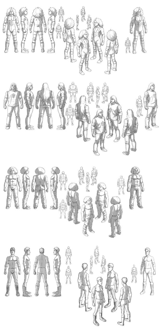
I'm learning to draw. What I mean is, I'm studying better perspective and anatomy (drawing every single bone and muscle until I will be able to draw them from memory) and put objects in space
Also it seems this time I've really learned to use graphic tablet. Is more than one month straight I can draw with it without thinking)

Also it seems this time I've really learned to use graphic tablet. Is more than one month straight I can draw with it without thinking)
Those are drawn from references.
domenica 12 gennaio 2014
I hope I will be able to start the comic soon...
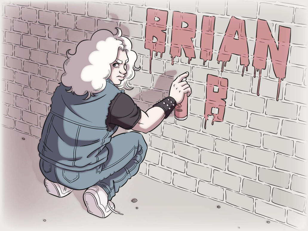
Drawing style is changed a bit.
New list on my dreams
1 - draw and make web comic 'Rough Dream'
2 - move to Norway (but avoid Oslo)
3 - write 'Remembering the Yellow Sky' or 'SK'

sabato 16 novembre 2013
Practice on tablet, from the basis
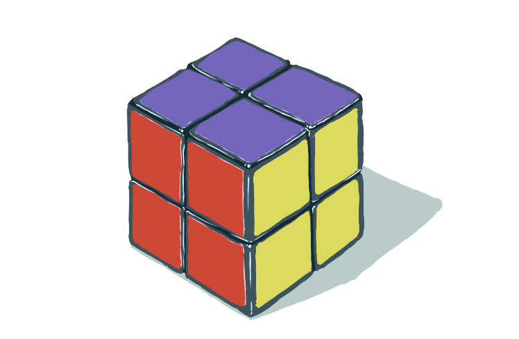
UPDATE - Great. I'm starting to fell more comfortable compared to yesterday. Faster and longer lines. And yes, I confirm the left hand collaborates better with tablet and I almost never use ctrl+Z
Then reading around I discovered that I drew in a uncomfortable way (I even have pain on my back and shoulders for this) and I had to move tablet on the table. Plus, as I suspected earlier, it seems that my left hand is better for the tablet, but earlier (like every time I do something new) I could not fell clearly which hand was better (On the tablet, I can make almost straight lines and control pressure with the right hand but I still can't control direction after months, with left hand I'm not yet used to draw with tablet but I can control direction)
I think it should take 4 days again But I don't fell the urge to learn as before, since I'm more curious to getting used to a new technique of drawing I just learn during last two months.
domenica 21 luglio 2013
I'll take a bit of time to write something about me...
... because I will not post new art this week.
As I already told in this blog, I was diagnosed with autism at the age of 3.
Since I was 11, I didn't nothing about visit to psychologist etc, but I worked by myself, in order to improve my comprehension of communication, social skills etc...
Is happened that recently, a person I and my brother know, was diagnosed with autism aswell. and plus, my brother and my mum realized I'm having some difficult in everyday life. As difficult I mean certain things is perfectly normal to do, but they don't come spontaneous to me.
So my brother organized a visit with a psychologist for me, and few weeks ago I and my mum went to psychologist. I was worried. But result of the visit was good. During those 30 years of life, I learned a lot of things that many 30 years-old autistics don't know yet, so I think I can say I am a very high functioning autistic. Psychologist suggest me how to overcome problems I have on multitasking and told me that I need to work on my social skills (I'm naturally an extroverted, but when I was little I approached people in wrong way, so now I am a bit scared when I have to approach people I don't know). This does means that I will probably have to do some volunteer works (related to drawing) in nearby kindergarden and probably I will have to draw social stories for autistic kids.
At the moment I'm trying to improve in everyday life, but is quite difficult.
At the moment I'm trying to improve in everyday life, but is quite difficult.
sabato 20 luglio 2013
That's cool
Another thing I like about Taker, is the fact that in the rare pictures where you see him smile, his smile is genuine. A lot of famous people show fake smile in pictures. Smile is the facial expression I know better, and I find the fake smile (the one often shown in photography) is irritating (Waaah teeth!!!)
venerdì 19 luglio 2013
Rotten

http://fav.me/d6e6r7x
I hope my sketchy sketches don't annoy you. But I need to practice on sketches. (today I hadn't a lot of time for an accurate drawing)
If you don't want to see my sketches I will not show you them anymore.
Rotten is a tertiary character that appears just once in Rough Dream. I think he is the most disturbing character of the story.
His look is inspired to Gollum, and I will define this character better with time. at the moment he's not fully defined, but his personality is clear.
In silhouette he looks a lot like Harald. But he has bigger chest, flat hips and thinner limbs. Also he is 24 cm smaller than Harald, so his general proportions are different (now that I give a look to silhouette, they are different. Somethimes I see my character more alike than they really are, because later I can recognize them very easily from their silhouette) .
If you think a small framed man can't fight, well, see this: http://media.northjersey.com/images/McFadden2_030112_td_tif_.jpg
Although he appears just once, I prefer to give a well defined look to characters that help the story to advance (I don't like when characters that talk once with protagonists are generic/approximate)
I didn't describled him again, I just talked about his (only)match.
Rotten (c) by Alice Sacco
Say hello (fuck you) to Gestapo

http://fav.me/d6e10b1
Gestapo is a tertiary character that appears just once in Rough Dream. As you can guess from his name, he play the role of a nostalgic nazifascist.
His look is inspired to Brock Lesnar's look, and I will define this character better with time. He should look stupid but also scary.
Although he appears just once, I prefer to give a well defined look to characters that help the story to advance (I don't like when characters that talk once with protagonists are generic/approximate)
Words that describle him (from the second draft) - (*spoiler*) fought against an opponent as big as Olav... maybe even bigger, due to massive steroid use.
Gestapo (c) by Alice Sacco
mercoledì 17 luglio 2013
Special/only for the blog - Hvorfor alltid meg?

A unhappy Olav, sketched in few second. I wonder why I can't always sketch like that (Yea, yeah, I know there is still room of improvement, but this is the best I can do at the moment - when I sketch.
Daily 12 - Waiting Room

I sketch 4 times faster than 10 days ago, but I need to become faster on sketching, So I will have more time to make my sketches precise, then I can do better lineart (this drawing lacks of precision)
Also, I want to avoid screentones. Rather I want to do a black and white comic with clean lineart.
This scene happens at the start of chapter 15. I choose the less interesting part (the moment is important, but this scene doesn't reveal a lot).
Talking about useless information, I have problems to define Brian's dressing style. In this scene he is almost 23, so he can't have a extreme look anymore. My brother suggest to look for glam rock, because that style fits Brian. At the moment I didn't cheeked.
Olav loves soft and comfortable clothes. Even if he is 6.8 feet tall (Using american measurement without understanding them - I know that is 2.07 m), he can find clothes that are a bit larger than him.
Bjørn instead likes to wear almost formal clothes, and if not formal, he likes to dress well (unless he doesn't fish)
Brian Brushes, Olav Sørensen and Bjørn Tennfjord are (c) by Alice Sacco
That's not daily sketch anymore. But at least now I'm trying to finish every drawing, instead to practice only. I need to learn to draw more like a comic artist, and to forget about colours and filters for a while.
Daily 11 - Murray
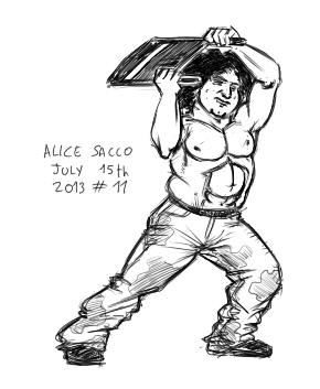
- Just ONE HOUR -
At the start my skecches took 4+ hours. I'm getting faster now.
Chris Murray (c) by Alice Sacco
PS - I start to love this character!!!
Daily 9 - Figure 4 leg lock
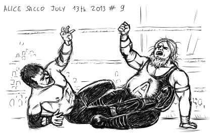
Bjørn Tennfjord and Harald Næss are (c) by Alice Sacco
As always WWE references used.
Harald needs a deeper analyzis. Is one of the most important characters from RD
sabato 13 luglio 2013
That's why I'm not an artist
Because 'artist' is became a label that doesn't fit with my personality.
I saw many artists being unpolite just because 'a true artist is not a hypocrite, is completely honest, and good manners don't belong to true artist'. I don't know why they absolutely need to be so unpolite to the point to look artificial and to state so often that 'they aren't hypocrite'. If they aren't hypocrite, people will see this, without the need to scream to the world tha they aren't that way. Is a problem if a creative person is well-mannered? Is a problem if a creative person wear ordinary chlotes? No
Also, artists claim to be left winged (or far left) just because of the romantic view the left wing represented... 40 years ago. Labels like 'liberal' are used out-of contest (how they can claim a drawing stile is liberal or conservative? I always called drawing style 'experimental' or 'classic'), and for those artist liberal does means good and conservative does means evil. Those artist are so open minded at the point of intolerance toward who doesn't think like them. Now hate me, liberal artist!
Artists (in the label) claim to they have duty to change the world. So they create stories and characters with the only aim to say what they think (the same things they write in their blog). So we always have one of their character (usually their favorite) with the role of being the spokesman of the author. In the story, is always found the occasion to show the wise spokesman character to tell all values of the artist. And to me it looks forced. I pay attention to avoid that some of my character may speak my mind. Some may have my values, some are different than me, but the aim of my stories is not to shove my ideals down of the throat of my readers, but to talk about experiences everybody will have. But I'm a evil conservative.
Misanthropy is also a must. Artist are the best and misunderstood good human being among the evil beasts. They are so good, superior and their fellow humans are so evil, they fell to be victim of the world, while nobody other than their (inferior) friends care about them and what they think.
I don't hate humans, why I should? I may don't understand some things about people like 'why they don't say things directly' (and this has nothing to do with being unpolite), or more simply 'Why they aren't honest with therisleves?'
But from here to HATE humans the road is long... very long.
Modesty, misunderstood with self flagellation mixed with high horse. Many artist say that their work sucks, that they aren't good at all. They fell jealous of characters that are created by other people, and when they see an artist that is better than them, they start to cry 'I'm not worth, I suck, I'm an incompetent' et simila'.
At the same time, they claim how great their knowledges are, they criticise harsly very good artist, claiming they can't draw (one of those artists that 'can't draw' worked very well with story telling, facial expressions, dinamism, shots and perspective, at the point I called him 'genius').
Now few words about modesty, or the term itself: As modesty, I mean understanding that there is always room of improvement and we should be always ready to improve, without being jealous of who is better than us, instead we should be inspired by them. Claiming 'I suck' or 'my character sucks' is not modesty. If your character really suck, is because they have to be re-thought and re-drawn from zero.
I'm not a real artist because I try to be polite (sometimes I fail and I don't notice it if someone doesn't make me notice this).
I don't fell the need to scream to the world that 'I'm not a hypocrite'. If i'm really not a hypocrite, people will understand that without the need to claim that.
I never hide the fact that I'm right-winged conservative, pro Israel, but also pro-gay rights. Political views have nothing to do with the ability to create something. They are part of our own values and our experiences.
The duty to change the world is also meaningless. Is a big utopia that follows the words of the song 'imagine' ('70's), instead is better to be more realistic and to improve what is around us instead to wishing for a unique country, unique language, unique culture (what a sad world).
My character don't represent me and don't speak my mind. Some have total different value than me, all are imperfect (I try my best to make them imperfect) but the protagonist must have the best qualities because of his role in the story (and that's normal). And then I don't believe in misanthropy. How I can think that I'm good and the other are evil? Nobody did something bad against me (Ok, except bullies, but I don't care anymore).
Also I had the phase where i though 'my drawings sucks' ecc ecc... Looking back I think is true that my old drawings sucks, so what? Now I try to improve at drawing, and i try to get inspired from artist that are better than me and that I like (in unfortunate I don't like all artists that are better than me).
Another thing that don't make me a real artist is my approach to creation. Whatever are my choices in stories, characters or drawings, I need to think why I draw that way, why i write that thing and why my character act this way. Even if I start with a idea I like, then I need that my ideas make sense. My characters don't write the story, I write the story of my characters, and this doesn't make me a real creative person.
I have my drawing style and there are reason behind my choices. I may post something about that later
giovedì 11 luglio 2013
Daily 8 - Axe Guillotine Driver and..
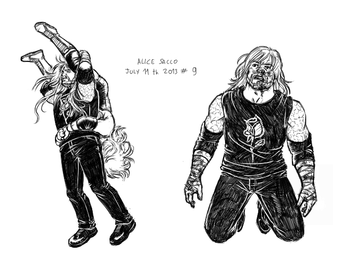
The other is Olav injured (based on a picture of the Undertaker).
Olav Sørensen (c) by Alice Sacco
I love this character. Despite being the so caled 'dark and handsome' (in general i don't like 'dark and handsome' characters. Anyway Olav is just 'dark', not handsome, I think he is rather ugly), is extremely easy to move and has a great range of facial expression.
For example (he changes because is drawn in different periods - also sorry if I fail to recognize facial expressions)

Melancholy (I think)
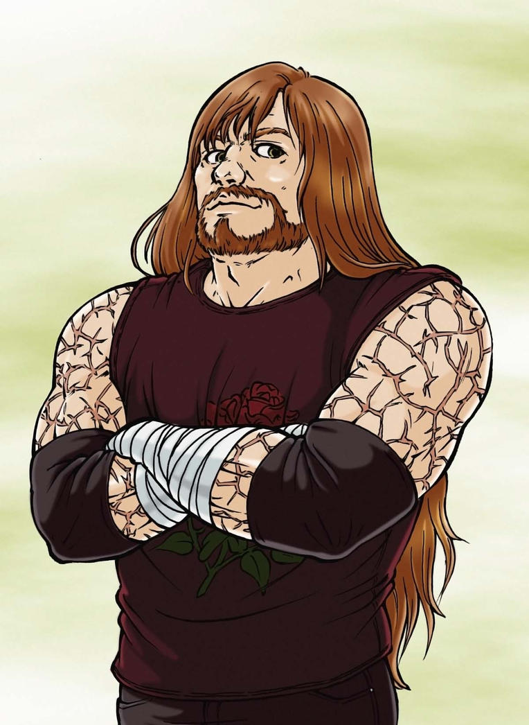
Happy (I love his happy expression)
Serious (But I can't see his eyes)
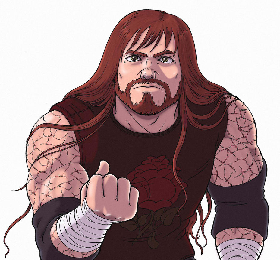
Ready to fight (for long I though he has creepy face)

Very very sad (But you can't see him this way very easily)
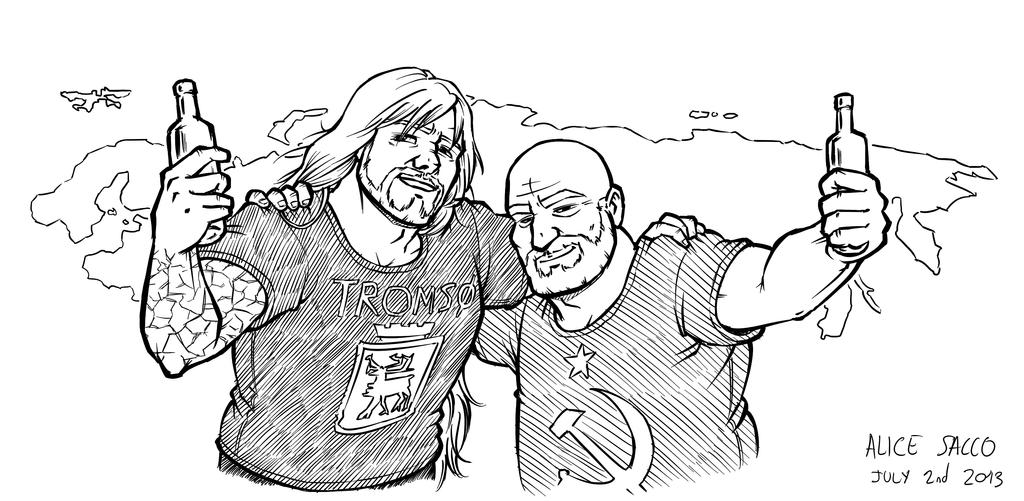
Friendly
Also I think he has a nice smile (in those rare moments where he smiles)
mercoledì 10 luglio 2013
Daily 8 - Fat wrestler / News about RtYS (the twin series)
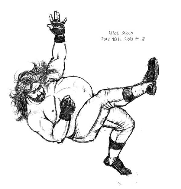
I wonder if doing daily sketches will really help.
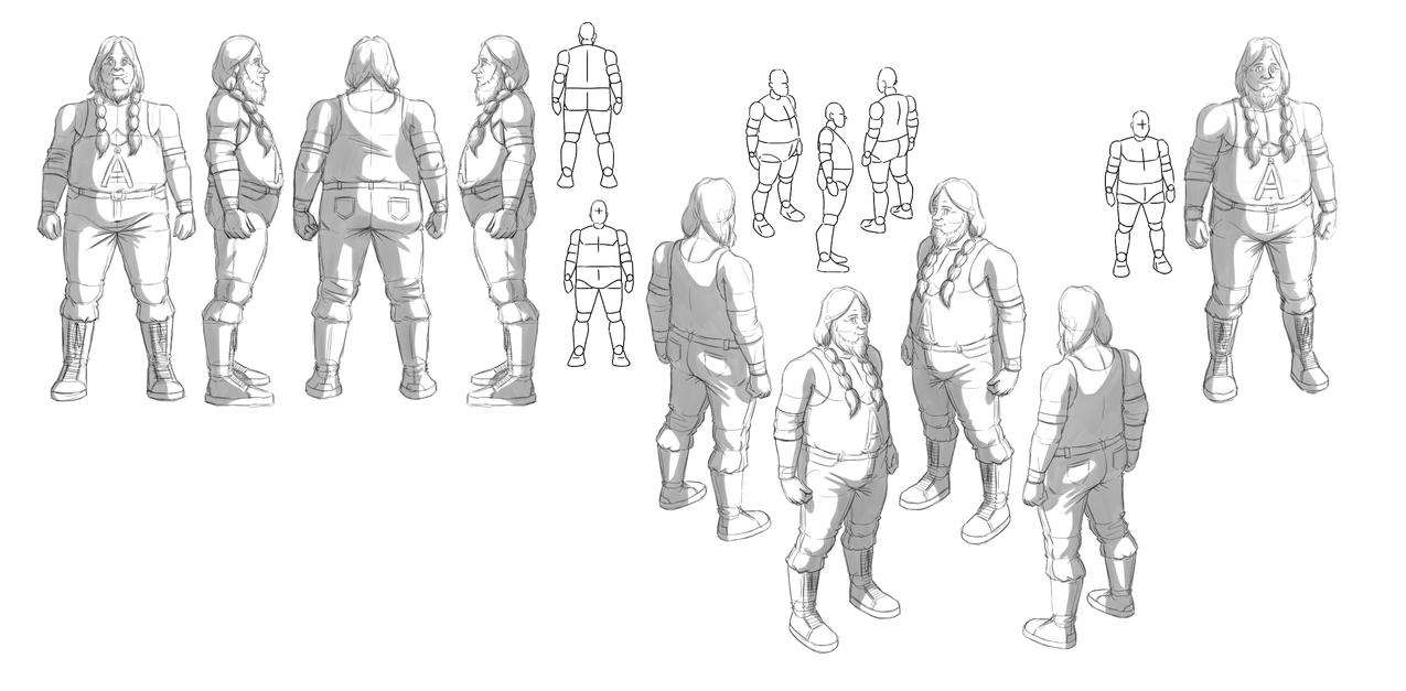
Fat people are hard to draw
Andreas Brushes (c) by Alice Sacco
Fat people are hard to draw
Andreas Brushes (c) by Alice Sacco
Also, I mentioned this serie
more han a year ago.
There are news:
Character design of all characters was set to default and now I'm re-working on design.
The old character design you know is officially canceled.
Now I'm studying the new character design of the twins. At the moment I can't even show the new character design, because it contains spoiler (Yes! the look of the Twins is strictly related to the new plot), but I think they're far better looking than before! :3
On the Other hand, I may show, in future, the new character design of Daniel, Claudiu and Matteo. their character design don't reveal bits of the story.
If you fell to draw Alice and Elena, you may use their old character design. Their colours are still valid.
martedì 9 luglio 2013
Daily 7 - Forakter motstanderen

Is not a character I like. I need to learn to appreciate him while working to the third draft, to enter in his mind and to understand his feelings.
At the moment I'm starting to appreciate more Chris.
Maybe I should do the first sketch by hand? I'm faster when I draw traditionally.
Harald Næss and Bjørn Tennfjord (c) by Alice Sacco
lunedì 8 luglio 2013
Daily 6
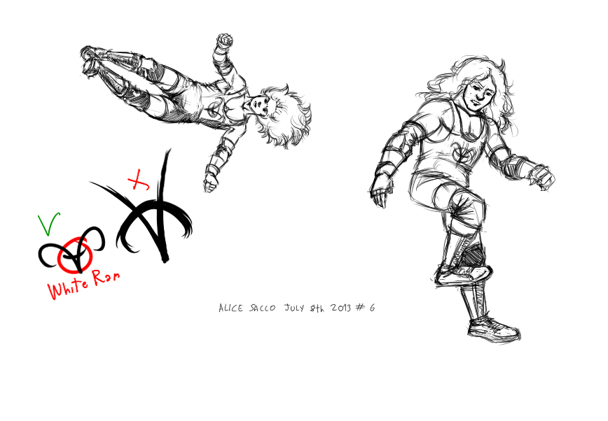
This was more funny to draw, and...

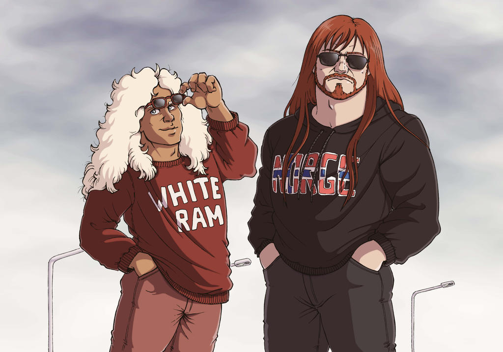
Brian has a new, original icon, in place of the word 'WAR', that was more related on a past and now discarded project.
Yeah, is inspired to 'V for Vendetta' icon, even if I do not agree with anarchist values. But at least it looks more familiar.
Also it should remember a ram head (his name is white ram)

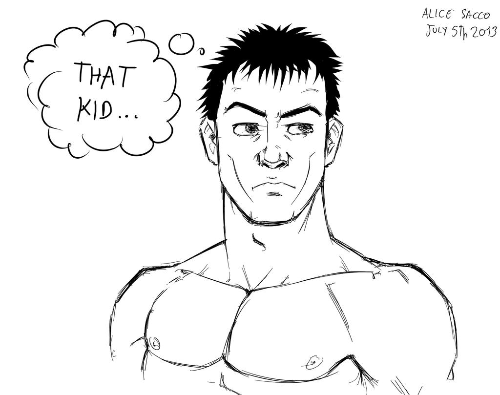
giovedì 4 luglio 2013
Daily 4 - Å i Lofoten, paradise
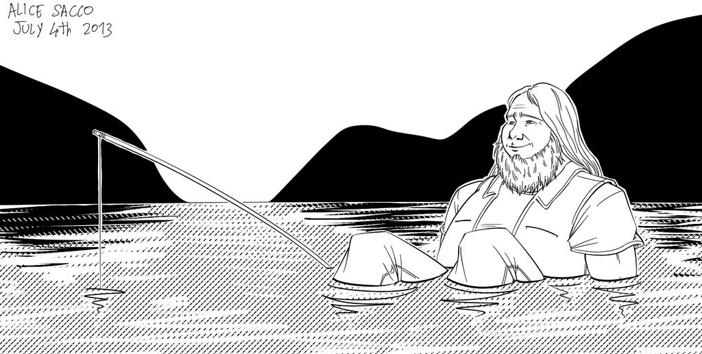
So, Harald Næss will be the last, then another cycle...
I was getting tired soon of the thick lineart, I don+t like it very much. So today I tried a thinner and cleaner lineart.
I need to learn to avoid screentones. My drawing should look interesting without colours and screens, but at the moment I will work more on lineart.
Bjørn (c) by AliceSacco
mercoledì 3 luglio 2013
Daily 3 - Biker Andreas Brushes
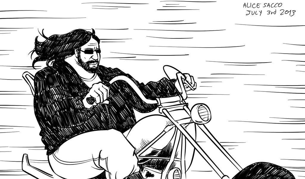
I don't draw him very much. He is a extremely calm character and is quite static when he acts. Is not only because of his size.
Draw so fat characters is difficult.
But as i said I need to learn to draw decently in little time.
(c) by AliceSacco
Tomorrow I will change the way to do the lineart. I like thick lineart less and less.
Iscriviti a:
Post (Atom)